The following are maps that I’ve used in the past when teaching about growth and geography. The overall story that I think comes out of these maps is concentration in economic activity. At the country level, GDP per capita is highly concentrated in Western Europe, the US, and Japan. But even within countries, economic activity is highly concentrated in small areas. And even within those areas, economic activity is highly concentrated within cities. I think it’s useful to mentally compare that concentration with the concentration of several geographic factors related to agriculture and trade. You’ll see what I mean below.
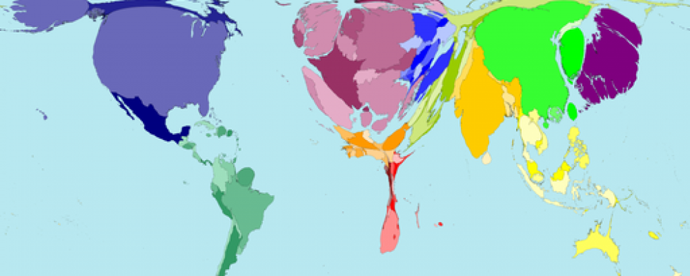
GDP per capita by Country
Straightforward map of GDP per capita. You can see the concentration in a few countries in North America, Europe, and then Japan/Australia/New Zealand in the Pacific. Africa is demonstrably poorer than other areas, with parts of Asia and Latin America climbing into the middle ranks.

GDP Density
The concentration becomes more apparent when you interact this with population concentration. Take GDP per capita times number of people per square kilometer. This gives you a sense of how concentrated absolute economic activity is on earth. GDP tends to be concentrated in high-latitude places close to water. This also shows the lack of economic development in equatorial regions generally, excepting India, which through force of numbers has a high GDP. From Gallup, Sachs, Mellinger (1998)

Night Lights
The next map is satellite imagery of night lights on the Earth. It shows the same concentration of economic activity into very small areas, but is perhaps more stark in demonstrating that even within countries economic activity is confined to very narrow geographic spaces. There are huge swaths of the world that essentially have no lights. This image is from elsewhere, but Henderson, Storeygard, and Weil (2012), used data like this to improve estimates of economic growth over time.

Europe at Night
I included this because it shows that the concentration of economic activity is “fractal” in the sense that as you keep zooming in, the spacing of economic activity continues to cluster into tighter and tighter agglomerations. All the main cities of Europe are easy to pick out here, and if you look closely you can see the little threads of lights that connect big cities to other big cities (look at Russia for a good example).

Ocean-Navigability
Shipping by water is extremely efficient, so being near the coast or near a river that is sea-navigable would presumably be a good thing for development. The map below shows all areas within 100KM of either the coast or a sea-navigable river. Notice that Europe is just thick with these, and essentially every river can get you to the ocean. Check out the overlap of this map with the density of GDP – almost perfect correlation. (Original data is here, but I copied this map from a paper at some point. So sorry for the poor resolution.)

Ocean Trade Routes
The following map plots the routes of container ships from 1980-1997. Not quite up to date, but you can get the picture. The neat part is that there are no actual borders plotted, but you can easily make out the continents. This is a neat complement to the maps of GDP density, as you can see that most economic activity is concentrated in small coastal areas, but that these areas trade with each other intensely. The bulk of economic activity takes place in exchanges between a relatively small handful of densely populated areas in East Asia, the west and east coasts of the U.S., and Europe. I posted this and a version from 1860 a while back, and that post includes the ultimate source.

Wheat Productivity
Agricultural productivity is a big factor in relative development. And there is massive variation in the inherent productivity of land for agriculture. Below is a map of crop suitability for wheat, using “high input levels”. Source is the GAEZ project. This shows the combination of areas that are both naturally good for wheat and particularly benefit from the application of inputs like fertilizers. As you can see, the rich areas of the world overlap with the areas in which investments in agricultural inputs are worthwhile. Without posting hundreds of maps, it isn’t possible to show how things vary by input level and crop. But for the most part, this map captures the natural advantage of the central US and Europe (writ large) in producing crops. Altering the crop or input level doesn’t change the relative patterns a whole lot. (Sorry for the lack of a legend, the GAEZ posts those as separate files. Green is good, orange is not so good, and gray means you cannot produce this crop)

Maize Productivity
Okay, one more agricultural productivity map. The one below is maize productivity using “intermediate inputs”. Compare to the above map, and you’ll see that the US, and to some extent Europe, still have relatively productive maize areas. But the rest of the world can at least get in on the game with maize. But note that while lots of places in Africa and Asia can produce the crop, we don’t see many dark blotches of green. Absolute productivity isn’t that high in most places.

Rainfall Patterns
Part of the agricultural productivity story is the pattern of rainfall. Rain-fed agriculture is relatively easy to do in places where rain is regular over the course of the growing season or year. In contrast, if you only have heavy seasons rainfalls (e.g. monsoons) then you have more variability in rain, and you need to invest in water containment systems. Most irrigation systems are there to capture existing rain water and dole it out slowly, not bring water to areas where it normally doesn’t fall (don’t let California fool you). The map below shows that the places with very high productivity in agriculture tend to also be places with regular rainfalls, not concentrated rainy seasons. Source is here.

Groundwater
The stock of groundwater is a separate issue from rainfall patterns. The map below gives you some idea of the available stocks of groundwater in the world. The darker the tone (regardless of color), the faster the groundwater “recharges” or gets replenished. Similar to the agricultural productivity maps, the US and Europe are generally well-endowed with groundwater that recharges relatively quickly. The other places where groundwater replenishes quickly are the big tropical rain forest basins in South America and Africa. These places, though, replenish too much, in some sense, as the amount of rain leaches nutrients from the soil. The general point of the last several maps is that rich places today like the US and Europe are in “sweet spots” for natural resources and agricultural productivity.

Colonies in 1914
Colonization cannot be ignored when studying comparative development. The map below plots colonial empires in 1914, which is right around “peak colonization”, at least from a population perspective. Places that are not colonized on this map – Persia, Central America, South America – either would soon be de facto colonies (Persia) or were de facto colonies in the past (Latin America). To a first approximation, the entire non-European world was at one time or another subject to some kind of European colonization, whether explicitly or as an implicit client state. Was this colonization a determining factor in making some countries poor? Yes, probably? The cases of the U.S., Canada, New Zealand, and Australia are really the exceptions that we have to explain relative to the rest of the world.

Colonial Trade Routes
What were the Europeans doing with their colonies? Primarily moving raw materials out of colonies and into Europe, and sending back out some processed goods and precious metals. The map below shows several things. First, that the global trade patterns seen in the maps above from today are really similar to those of hundreds of years ago. The big shift has been the elimination of the routes around Africa (thanks to the Suez canal) and the explosion of Asia/western U.S. routes. Second, colonial trade routes were in large part about trying to connect Asian centers of production (India, China) with European centers of production. The concentration of economic activity in those areas made them the logical places to try and connect. Sailing around Africa to get to them was the most efficient way to do this for a long time. Source here.

Medieval Trade Routes
The Silk road and associated trade routes of northern Africa were the main connection of Asia and Europe before colonization began. The map below is a stylized plot of those routes. The really interesting thing to note here is how this map complements the one above. These trade routes are completely outflanked by Europeans in ships. Notice the big hollowing out of the Muslim area in the colonial trade routes above. If we talk about “reversals of fortune”, one aspect has to be the loss of these trade routes. Some of the most urbanized places in the world were in Muslim areas in 1500, and once Europeans did not need to go through them to trade with Asia, they stagnated.

The Slave Trade
Below is a map showing the estimated totals of African slaves taken to other countries. The absolute numbers are staggering, with millions and millions of people being wrung from their homes. The long-run impact of this trade on economic development on Africa is something that Nathan Nunn, in particular, has explored in several papers. Source.

Migration Flows Since 1500
Economic activity is highly concentrated not only geographically, but concentrated on certain population groups. Europeans, wherever they ended up, are relatively rich today. The US, Canada, Australia and New Zealand are often called “Neo-Europes” for a reason. Argentina, Uruguay, and Chile also are home to large populations of European-descended immigrants. Because we think of Americans or Canadians as their own nationality today, it is hard to keep straight how massive European migration was relative to other migration flows in the rest of history. Source.

Oil Reserves
I had trouble finding a good map that was recent enough to reflect the shale/fracking revolution in oil production. This map is up to date, but not terribly well done in that it is hard to actually distinguish the reserve levels across countries. The interesting thing about oil is that unlike most other geographic features, it is *not* concentrated on Europe/North America. It’s concentrated, but in entirely different places. Europe especially has little to no oil, nor do they have the ability to extract those resources from other countries on their own terms. Africa is also dependent on inflows as they develop. Another reason why alternative energy would be a massive disruption, it would set these places free from oil imports.

Solar Power Potential
This is partly an excuse to show the really cool map below (source is here, but I can’t find original NASA link). Solar potential across the globe. Note that this is also another resource that is not concentrated on Europe/N. America. So advances in solar have the potential to change the underlying endowments of countries around the world. Best development aid we might provide to poorer countries is researching solar technology and giving it away.

