Moving Day!

The Growth Economics Blog is moving to a new site. I’ve consolidated the blog with my personal website (research, class info) into growthecon.com

  • RSS feed. There is a new RSS feed you’ll need to receive posts. Click the link to put the feed in your favorite RSS reader.
  • Email subscribers. You should not have to do anything. I’ve exported the e-mails of everyone, and set up a MailChimp account that will forward you new posts as they come out. If you don’t see anything in a few days, check your spam or let me know at “dietz.vollrath+blog@gmail.com ” and I’ll get it sorted.
  • Twitter. There should still be tweets for each new post, so if you find me @DietzVollrath, nothing to worry about.
  • Comments. These are enabled on the new site, although you might need to put in your email/name the first time you post. Existing comments have been ported over to the new site.

I’ll be cross-posting on both sites for a limited time, hoping to catch anyone who misses out.

In case you’re curious, I bought the new domain name using money I received from Amazon links on my site. When I post an Amazon link, and you purchase anything, I get a small percentage. The amount I get is sufficient to buy pizza and beer about once a month. This Christmas the Roman History Reading List generated more action, and I blew it on buying the domain name. Thanks!

I also switched over because I wanted more control over the blog site and my own site. I got frustrated writing in Latex or Markdown, and then having to jump through hoops to get my posts ready for WordPress. I’m using Jekyll and Github on the new site, for those that are interested. It’s built totally on static text files, which is something that satisfies my Unix lizard-brain.

I’m sure that I have screwed something up, so if you find yourself unable to read the blog or link to old pages, just let me know. Thanks for reading.

The Declining Marginal Product of Capital

NOTE: The Growth Economics Blog has moved sites. Click here to find this post at the new site.

A few weeks ago I posted about the recent decline in capital per worker in the U.S. The short summary is that from 2009-2013 capital per worker has been shrinking, and this is at odds with most of historical experience. This shrinking capital per worker contributes to higher measured productivity growth.

The illustrious Areendam Chanda asked, in response, what the marginal product of capital looked like given the decline in capital per worker in this series. This is straightforward to calculate given the BLS data, and it shows what I think is an interesting pattern.

First, I calculate the MPK as

\displaystyle MPK = \alpha \frac{Y}{K} \ \ \ \ \ (1)

where {\alpha} is capital’s share of output. If the world is roughly Cobb-Douglas, this should describe for us the extra amount of output we could get from one additional unit of capital. This is an aggregate concept, and doesn’t necessarily map to any specific use of capital (e.g. the marginal product of a laptop can be different than the marginal product of a shovel). This is the marginal product of dumping an extra unit of homogenous “capital” into the economy.

Here’s the figure showing the time path from 1960 to 2013:

Marginal Product of Capital

In terms of the recent decline in capital per worker, the uptick in the actual series (black line) from 2000-2013 makes some sense. Declining capital per worker should be associated with a higher return on capital. But what appears to be true is that the recent uptick in MPK is driven by a change in capital’s share in output. I plotted in gray an alternative MPK that assumes capital’s share is constant at 0.31 (a rough long-run average), and as you can see this continues the downward trend of the prior decades. The uptick is due almost entirely to the increase in capital’s share of output.

What seems far more interesting in this figure is the general drift downward in the MPK since 1960. I can come up with two different interpretations of this, which depend a lot on the time frame you consider.

Secular shift in MPK: Essentially, interpret this as evidence of some kind of sustained, secular change in the US economy. The drift down in the MPK isn’t consistent with the US being on a balanced growth path (BGP). As a quick reminder, traditionally a BGP is a situation where GDP per worker is growing at a roughly constant rate, the return on capital (MPK) is constant over time, and the share of output going to capital is constant over time.

And we almost always presume that the US is on a BGP. I will be telling my undergrads this in a week or so, I’m sure. Almost every growth model is written so that it delivers a BGP eventually, because people feel that this represents what we see in the data. And when they say “BGP” in their model, they almost always mean that the MPK is constant.

In a standard Solow model, the steady state is a BGP, and the model tells us what determines the MPK on that BGP.

\displaystyle MPK = \alpha\frac{n + g + \delta}{s} \ \ \ \ \ (2)

where {\alpha} is capital’s share of output, {n} 
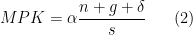
is population growth, {g} is productivity growth, {\delta} is the depreciation rate, and {s} is the savings rate. Note, this equation is for the MPK in steady state, not necessarily at any given point in time, but it is useful for thinking about what might drive the decline in MPK.

The steady decline in the MPK over time is consistent with declining {n} (because capital’s marginal product is lower when there are fewer people around), declining {g} (slower productivity growth), and higher {s} (more savings). In this story we are transitioning from the immediate post-war era of relatively rapid population and technological change, to a new era of relatively low population and technological growth.

It’s worth remembering here that the MPK is calculated using the BLS data, which excludes the government sector and the residential housing stock. So this represents a decline in the non-residential-housing MPK.

Return of MPK to Long-run trend: But from a long, long-term perspective, maybe the decline in MPK since 1960 is just a reversion to a steady state value? The MPK should be roughly a proxy for the return on capital. One other rough proxy for that is the earnings yield on the S&P 500, which represents how much you get in earnings for buying a “unit” of capital by purchasing a basket of stocks. The figure below, which I grabbed from Brad DeLong’s site, plots this earnings yield from 1880 until today.

SP Earnings Yield

From this it seems to me that the earnings yield has a “normal” level of about 6%, and that while there are sustained deviations from this value, it always appears to head back to 6%. The first figure shows that MPK has been declining from 1960 until now, matching the decline in the earnings yield from rouhgly 1970 until today. Was the MPK just on walkabout, and is coming back to its long-run BGP level? And no, I’m not terribly worried about the fact that the MPK is always higher than the earnings yield. They are both proxies, so the fact they don’t agree on levels isn’t terribly meaningful.

The earnings yields suggests that what is abnormal about the figure for MPK is the high values in the 60’s and 70’s, not the low values now. The S&P evidence is consistent with that, although the match-up is imperfect. Why was the MPK so high in the 1960’s, while the earnings yield didn’t rise until the 1970’s?

Regardless, in this interpretation, the steady state MPK has stayed roughly the same, but for some reason we deviated in the 60’s and 70’s to having a high MPK. Perhaps it was atypical shocks to productivity (over and above the regular trend growth rate {g}), or atypical shocks to population growth (Baby Boomers?), and we’re now coming back down to normal.

The caveat here is that the S&P earnings yield might be a bad comparison for the MPK. But given that the MPK is ex-residential-housing-capital and ex-government, perhaps not.

I don’t know that there is a way to distinguish between the two stories, not without doing more research that I don’t have time to do right now. Without taking a firm stand on this, one important point here is that the explanation depends crucially on what you take to be “normal”. And that depends in part on how far back you graph the data. The S&P data suggests a different story than the MPK series (and the MPK series doesn’t go back any further because the BLS doesn’t have the requisite data any further back). I guess it is a caution that the starting point of your data series is not necessarily the same thing as the “starting point” of the economy.

Do You Need More Money for Economic Growth to Occur?

NOTE: The Growth Economics Blog has moved sites. Click here to find this post at the new site.


TL;DR version: No.

This is another entry to file under “notes for undergrads” and/or “explaining things to your neighbor”. A very common question I get about growth is: how does growth occur if there is not any “more money” in the economy. Another common question I get is: how is it economic growth if spending on one product just replaces spending on another?

These questions come, I think, from continued confusion about (a) nominal versus real GDP, (b) nominal GDP versus the stock of money, and (c) absolute versus relative prices. In short, things an economist might call money illusion. In the defense of students and my neighbors, it isn’t terribly easy to think in relative prices and real terms when every single transaction you undertake involves absolute dollars.

Let’s start with an economy that produces exactly 10 cans of Budweiser, and nothing else, in a year. They each sell for $1, meaning that nominal GDP in this economy is $10 for the year. What is real GDP? Well, we already really know the answer – it’s 10 cans of Budweiser.

Real GDP is measured in “real units”. That’s obvious in this example, because the real units are obvious – cans of Bud. To do this more formally, we find real GDP by dividing nominal GDP by a price index. In this case, the price index is easy to figure out. It’s $1 per can of Bud. So real GDP is $10/$1 per can of Bud = 10 cans of Bud.

One confusion with real GDP is that the BEA and economic textbooks insist on talking about it in terms of dollars. That is because the price index they use is not something like “$1 per can”, but is something like “$1.37 per $1 of output in 2005”. So real GDP is $10/$1.37 per 2005 dollar = 7.3 units of 2005 dollars, which would be reported as “$7.3 (2005 dollars).” But despite being reported in terms of dollars, real GDP has nothing to do with money.

I sometimes think that we should save our effort at coming up with good price indices, and just use something like the price of a can of Bud, or a pair of Levi 501 jeans, as the price deflator in national accounts. Because then real GDP would be reported in real, tangible units, and would save us from confusing it with a nominal number. For example, if the price of a can of Bud was $0.50, then real GDP in the US for 2014 would be $17,615 billion/ $0.50 per can on Bud = 35,230 cans of Bud. Nominal GDP through Q3 2015 is $18,060, so that’s real GDP of 36,120 cans of Bud, a 2.5% increase in real GDP from 2014. I’m laboring this point because when it comes to explaining how growth works, this confusion between nominal and real concepts becomes a problem.

Let’s go back to our simple 10-can economy, with a price per can of $1, and see how growth works.

Growth through expanding production of existing products: This is the easiest to explain. Something happens at Anheuser-Busch that lets them produce even more cans of Bud with their given inputs. Perhaps they water it down even more than it already is. Whatever the reason, the economy produces 12 cans of Bud this year. We know that real GDP went up, from 10 cans to 12 cans.

But let’s walk through how to do this calculation using nominal GDP and a price index. Think of two possibilities

  • Nominal GDP stays constant. That is, nominal GDP is still $10. Then it must be that the price of a Bud fell to $0.83. The supply curve of Bud shifted out, and hence the quantity of Bud went up and the price of Bud went down. Real GDP is $10/$0.83 per can = 12 cans of Bud. For the given flow of money through the economy – which does not have any necessary relationship to real GDP – the price of a can of Bud must adjust to make supply equal demand.
  • The price of Bud stays constant. Let each can still be $1. The it must be that nominal GDP is $12, and real GDP is $12/$1 per can = 12 cans of Bud. Here, the supply curve of Bud has shifted out, but apparently the demand curve shifted out as well, leaving the price unchanged and the quantity higher. Why would this happen? Who knows, and who cares. It’s possible. For a given flow of money through the economy, the price of a can of Bud must adjust to make supply equal to demand.

Note that it is irrelevant whether nominal GDP goes up or stays constant (it could even fall). Whether nominal GDP rises or not is completely irrelevant to whether real GDP goes up. If we could observe the real quantity of cans consumed, we wouldn’t need nominal GDP at all. But we don’t actually observe the number of cans of Bud consumed. All we observe is nominal GDP and the price of a can of Bud. So when the BEA reports a nominal GDP of $10, and a price of $0.83 per can, we divide and infer that real GDP is 12 cans of Bud.

If your question now is where people get the “extra money” to afford 12 cans of Bud when their price stays at $1, take a moment to meditate on the equation {MV = PY}. We’ll come back to that in a few paragraphs.

Growth through addition of new products: This one will stretch the mind a little more, but the same principles are going to hold. Rather than Bud watering down their beer even further, we’re going to introduce a new beer into the market. Someone – and God bless them – invents Real Ale Coffee Porter. In response, people with functioning taste buds buy 5 cans of Coffee Porter, and everyone else still buys 5 cans of Bud. So we’ve still only got 10 cans of beer being sold. Is this economic growth, meaning that real GDP is higher?

It depends on relative prices. If those cans of Coffee Porter are more expensive than cans of Bud, then this represents real economic growth. Why? Because if the relative price of Coffee Porter is higher than that of Bud, then the relative marginal utility of Coffee Porter is higher than that of Bud. Assuming that utility for both has typical properties (declining MU), then we know the MU of the 5th can of Bud is higher than the 10th can. And since Coffee Porter has a higher MU than that, it follows that we are better off in utility terms. More intuitively, if we weren’t better off, then why were we willing to substitute away from Bud even though Coffee Porter costs more?

Which suggests that if Coffee Porter and Bud sold for the same amount, then we aren’t any better off. In this case it’s a perfect substitute, and the choice of 5 of each is just random. It’s the difference in relative prices that a new product introduces that defines it’s contribution of real growth.

So eocnomic growth is just about things getting more expensive? No. Note that I didn’t say anything about the absolute price of Bud or Coffee Porter – because that is irrelevant for real GDP. So long as Coffee Porter is more expensive than Bud, we’ve experienced real growth. That holds if Porter costs $2 to Bud’s $1, or $20 to Bud’s $10, or $0.02 to Bud’s $0.01.

Once we’ve established that there is a relative price difference, then the same questions about nominal GDP from before come up. Let’s say that we observe that Coffee Porter costs twice as much as Bud. How do we calculate real GDP?

  • Nominal GDP stays constant. It must be that Bud costs $0.67, and the porter is $1.33, so nominal GDP is $10 (multiply it out and you can see it). What is real GDP in this case? Sticking with our standard of using the price of Bud, real GDP is $10/$0.67 per can of Bud = 15 cans of Bud. It is as if our economy produced 15 cans of Bud, where before it only produced 10. There is real GDP growth due to the introduction of Coffee Porter – even though all Coffee Porter does is replace consumption of Bud and total beer drinking stays constant at 10 cans.
  • The price of Bud stays constant. If Bud still costs $1, then the porter is $2. So nominal GDP is $15 (again, just multiply it out). What is real GDP? $15/$1 per can of Bud = 15 cans of Bud. Real GDP has gone up. It is irrelevant what the nominal price of Bud is, we observe real GDP growth because the introduction of Coffee Porter introduced a relative price difference.

Notice that if all the BEA reports to me is nominal GDP and the price of Bud, I can infer real GDP regardless of what exactly happens. Our  “Bud-based” measure of real GDP goes up to 15. I don’t actually have to observe the number of cans purchased.

This example of adding a new product brings up one issue with price indices, which is product replacement. If – as would be logical if people tasted them – the introduction of Coffee Porter completely eliminated Bud from the market, then we cannot calculate real GDP. There will be no price of Bud to divide nominal GDP by. And we can’t just use the price of Coffee Porter, because yesterday all we had was Bud, and there was no price for Coffee Porter. One of the reasons we use more sophisticated price indices (that combine the price of Bud and Coffee Porter in some way) is so that we always have a price index to use. But that sophisticated price index, by putting things in “2005 dollars” or something like that, creates confusion between real GDP and nominal GDP. Always think of real GDP as being “cans of Bud”, rather than in dollar terms.

Now, If you are still wondering where people get the “extra money” to buy the Coffee Porter in this example, then the next section is for you.

Where does the extra money come from? Nowhere. There is no extra money. Nominal GDP is not a measure of “how much money we have”. Nominal GDP is the flow of dollars through the economy. The stock of money is, well, a stock. In all the examples above, what is the stock of money? You can’t answer that question, because I never said anything about it.

Let’s say that this economy has a stock of 4 one-dollar bills. Here’s the transactions flow in this economy in the initial stage, with only 10 can of Bud consumed:

  1. Person A starts with the $4. (Nominal GDP is zero)
  2. Person A buys 4 Buds for $4 from person B. (Nominal GDP is $4)
  3. Person B buys 4 Buds for $4 from person C. (Nominal GDP is now $8)
  4. Person C buys 2 Buds for $2 from person D. (Nominal GDP is now $10)
  5. Person D ends up with $2 and person C with $2. (Final nominal GDP is $10)

Then next period we start again, only now C and D hold the money stock. The money stock is always $4, and it gets turned over and over, resulting in $10 of nominal transactions, or GDP. (No, it doesn’t matter that the circle isn’t closed here, with different people ending up with the actual dollars.) Real GDP is 10 cans of Bud.

If we have the case where Coffee Porter gets introduced, things look like this.

  1. Person A starts with the $4. (Nominal GDP is zero)
  2. Person A buys 2 Porters for $4 from person B. (Nominal GDP is $4)
  3. Person B buys 4 Buds for $4 from person C. (Nominal GDP is now $8)
  4. Person C buys 2 Porters for $4 from person D. (Nominal GDP is now $12)
  5. Person D buys 1 Bud for $1 and 1 porter for $2 from person E. (Nominal GDP is now $15)
  6. Person D ends up with $1 and person E with $3. (Final nominal GDP is $15)

No “new money” is necessary. Real GDP is 15 cans of Bud. The same $4 gets recycled over and over again, this time used to purchase both Buds and Porters. Different people end up with money stock at the end. We could easily write out an example where the growth occurred because of just an increase in the number of Buds. And if you prefer that nominal GDP not increase, you can easily go back and work out the same set of transactions, lower the absolute prices, and get nominal GDP to come out to exactly $10. And yes, I made up these examples. But I just need to show you that it is possible to get economic growth even though there is no new money in the economy.

Economic growth occurs either because we produce more of existing things, or because we introduce new things that that are more valuable than the old things we produced – which shows up in relative price differences. The level of absolute prices is irrelevant. The level of nominal spending is irrelevant. The stock of money is irrelevant.

For any modern economy, it is effectively impossible for there to be “not enough money” to let growth occur. The economy as a whole can always turn over the money stock faster to allow for the extra transactions if necessary. Whether that turnover involves you, and means that you can afford to buy some Coffee Porter, is a different question, and involves your own productivity and/or ownership of a Bud- or Coffee Porter-producing machine.


Calculating Growth Rates

NOTE: The Growth Economics Blog has moved sites. Click here to find this post at the new site.

I’m prepping for my undergraduate growth course this semester (which uses an AWESOME book, by the way). We don’t require calc from our econ majors at UH, so I have to ease them into a few things during the course. One of those is using logs to both visualize and then analyze economic growth. This post is some notes I started working on to help introduce students to the concepts.

If you’re teaching, this might come in handy. If you’re interested in growth, but a little shy about math, this might be helpful. If you literally have nothing better to do, it will kill about 10 minutes and/or help put you to sleep.

We’re interested in living standards, as measured by real GDP per capita. We don’t concern ourselves a lot with the absolute value of real GDP per capita, as that number depends on exactly how we construct price indices, base years, etc.. What we care about is how fast economies grow. This is like saying that we don’t care whether you start at 150 pounds or 68 kilograms; but if your weight grows by 5% per year we know you are going to get fat.

To visualize those growth rates, and to do some crude analysis, we invariably plot real GDP per capita in logs. When I say log, I mean the natural log. There are lots of cool explanations of how natural logs work, but this post is not one of them. For now we’re going to take it on faith that natural logs work the way I say they do.

Take the natural log of GDP per capita in each year, and graph it against the year itself. The figure below, for India, is an example, where real GDP per capita is plotted using the grey line.

Natural logs have a few great properties for our purposes. Using them means that every step up the y-axis is an identical percent change in real GDP per capita. Going from 7.0 to 7.5, for example, is a 65% increase in real GDP per capita. Going from 7.5 to 8.0 is also a 65% increase in real GDP per capita. This is true even though from 7.0 to 7.5 is going from $1,096 to $1,800 in GDP per capita and going from 7.5 to 8.0 is going from $1,800 to $2,980. By plotting things in natural logs we can see the percent increases, rather than the absolute increases.

Even more fun is that because of this property, we can pick off the average growth rate between two years relatively easily. The average growth rate between two years is just the slope of the straight line connecting the two end points. In the figure for India, I’ve overlaid the calculation of the growth rate for several sub-periods, as well as the average growth rate from 1950 to 2010.

Real GDP growth in India

From 1950 to 2010, as an example, connect the two end points, and find the slope of the line. You could do this mathematically as follows

\displaystyle g_{1950,2010} = \frac{ln(3596)-ln(798)}{2010 - 1950} = \frac{8.19 - 6.68}{60} = 0.025. \ \ \ \ \ (1)

For the other sub-periods, you do the same thing, just using the end points from those time periods. So from 1950 to 1975, growth average 2.0%, from 1975 to 1985 if average -3.0%, and from 1985 to 2010 it averaged 5.2%.

Why those particular sub-periods, and not others? Solely because they looked like obvious break points. There is no formula for deciding what sub-periods to calculate. It just seems intuitive that “something different” happened around 1985, for example, that sets that period apart from the others. But you could calculate the growth rate from 1972 to 2003 if you wanted to. You want to argue with me that the 1985 to 2010 period should be broken up again into pre-2003 and post-2003 sub-periods? Okay. I can’t tell you you’re wrong.

The three sub-periods I did calculate have the feature that their average growth seems very close to the actual growth. That is, the actual path of GDP per capita doesn’t stray very far from the straight line we used to calculate the average growth from 1950 to 1975, for example. What do I mean by “very far”? Nothing technical, just eye-balling it.

Compare those three sub-periods, though, to the whole stretch from 1950 to 2010. We calculate average growth at 2.5%, but the straight line that gives us that answer lies well above the actual real GDP per capita for almost the entire period. Average growth from 1950 to 2010 doesn’t give us a very accurate picture of what the growth experience of India was like in history, where there really appear to be three separate periods.

That doesn’t mean 2.5% is wrong. It is exactly the average growth rate from 1950 to 2010. If you started at real GDP per capita of $798 in 1950, and applied 2.5% growth to that, you’d end up with

\displaystyle y_{2010} = 798 \times (1 + 0.025)^{60} = 3,511 \ \ \ \ \ (2)

which is just rounding error away from the actual value of $3,596. But the path from 1950 to 2010 looks a lot different at 2.5% average growth every year, compared to the actual path real GDP per capita followed in India in this time span.

Regardless, we’ll be interested at times in precisely those periods when the average growth rate is very close to the actual growth rate of real GDP per capita (the straight line is close to the gray line). 1950 to 1975, as we said, or arguably 1985 to 2010. These periods could represent what we’ll call “balanced growth paths”, or BGP’s.

We’re interested in BGP’s because our theories of growth are going to suggest that, in the absence of any fundamental change, a country will tend to end up on a BGP. That is, without any major shock to a fundamental characteristic of the economy, an economy will tend to have actual growth close to average growth. Further, if we see different BGP’s, then this indicates that something fundamental did change.

What the picture from India says is that the period from 1950 to 2010 was not a BGP for India. 1950 to 1975 could be one, and then in 1975 something fundamental was just different. What something was it? We cannot tell from this figure. We’d have to dig into other data on India to decide, and our theory might tell us likely candidates to explore. In 1985 something again appears to have fundamentally changed, as again India switched to what looks like a new BGP. And again we’d have to explore other data to decide what changed.

Just to be complete, what we see in the figure is necessary, but not sufficient, to establish that India was on a BGP. That is, there are other conditions that are also necessary to classify a period of time as being “on a BGP”, and there may be other reasons that India was not on a BGP from 1975 to 1985, for example, even though actual growth was close to average growth. But as a start, looking at a figure like this tells us where we should start looking.

To be even more complete, just because most of our theories suggest countries will end up on a BGP in the absence of a major shock doesn’t mean they are right. Our theories could be completely wrong. Maybe nothing fundamental changed in either 1975 or 1985, and all that happened was that India got really unlucky for a few years. Perhaps we are making too much of these extended runs of similar growth rates.

IQ and Economic Growth

NOTE: The Growth Economics Blog has moved sites. Click here to find this post at the new site.

I finally got around the writing up a review of Hive Mind, by Garett Jones. Short version is that the book is excellent, and well worth reading. I’ll get into more detail below, but the book explores the importance of cognitive skills (as measured by IQ) for economic development.

There are several reasons to like it. First, the book has absolutely no fat on it. This is a model of concise explanatory writing. Most books that try to bring recent research to the public end up bloated. Not this one. Five stars for clarity here.

Onto the content. There are really two parts to the book. First, Jones establishes that “cognitive skills” are in fact highly correlated with economic development, and a subsidiary part of this is establishing that IQ is just one of many ways of measuring “cognitive skills”.

I’m not going to go into a lot of detail here. Like I said, the book is very lean and you can easily read Jones’ own words on this. Let me summarize by listing his own five main channels for how IQ is related to economic development. In italics next to the channel are a few comments of my own on them.

  1. High IQ’s are related to higher savings rates. But we have evidence that savings rates don’t actually vary a whole lot across countries, and that what variation there is explains little.
  2. High IQ’s are related to more cooperation. For my money, the most important channel. Economic development looks a lot like people choosing the “cooperate” equilibrium in a repeated game. High IQ may be a marker for people willing to play this move, and to play it first, and often, even though the other players could take advantage of them.
  3. High IQ’s are related to market-oriented policies. Perhaps it is that high IQ people believe in their own ability to succeed?
  4. High IQ’s are related to using team-based technologies. I think I would lump this in with cooperation.
  5. People like to conform. This isn’t about IQ itself. But if you have lots of high IQ people with those other traits, then even those without high IQ’s will try to conform. A critical mass of high IQ people may be sufficient to reach the good equilibrium.

Let’s be clear here about the role of high IQ’s. They are a marker, not necessarily a cause, of these behaviors and traits. Jones is clear on this, and is not making some strong causal claim. Rather, think of all these traits (including high IQ scores) as a package of traits that tend to come together. Call these traits “cognitive skills”, as they typically involve some kind of ability to do abstract thinking.

An interesting note here is that lots of what the labor literature calls “non-cognitive skills” are what, I think, Jones would lump under cognitive skills. For example, patience is something that some refer to as a non-cognitive skill, but for Jones it is part of the package of abilities that come along with relatively high IQ levels.

The wrong conclusion to draw from Jones’ book is that there is some kind of fixed genetic difference in intelligence across countries that explains why some are rich and some are poor. These traits are malleable, as evidenced by the “Flynn Effect” of rising IQ scores over time. Cognitive skills certainly are related to economic development, but they are better seen as a more refined measure of human capital than years of schooling. You can invest in cognitive skills the same way that you can invest in years of schooling. One possibility might be more extensive pre-schooling that teaches those “non-cognitive skills” that are associated with IQ.

By the way, Feyrer, Politi, and Weil have a paper coming out on how iodizing water helped raise IQ scores in the US. There may be direct public health measures that could materially impact cognitive skills and IQ in developing countries.

The second part of the book delves more specifically into Jones’ research on the returns to IQ, or cognitive skills. Namely, why is there such a small premium on IQ within countries, but such a large premium to IQ across countries? Again, I’m not going to lay into a lot of detail here, he does a nice job in the book explaining the theory here. Let me try to give you the basic intuition.

High-IQ places are able to take on “fragile” production processes, where even one mistake ruins the output (e.g. a semiconductor or a hit movie). Economists often call these “O-ring” processes, after the Challenger disaster. Having lots of high IQ people means you have lots of high productivity, fragile, production processes, and this creates demand for other, non-fragile, production processes (e.g. retail). The high demand for the non-fragile process means that wages are relatively high for the low IQ people who can work that sector. Hence there is little difference in wages between the high-IQ people and the low-IQ people. But the average wage is incredibly high, because the economy engages in these productive, fragile production processes. So high IQ countries are very rich compared to low IQ countries.

Let me add that this disconnect of the within-country return to a trait (IQ, years of education, etc..) and the cross-country return to the same trait is littered all over the growth literature. Sometimes we think about these positive spillovers/externalities, but for the most part we do not. One nice thing about Jones’ book (and prior research) is that he does think about these things seriously. Even if you don’t buy the first part of the book, it is worth reading the second part (substitute “high-skill” or “high-education” in everywhere you see “high-IQ” and you’ll be fine).

I’ll be assigning parts of this to my undergrads this semester. It should be a fun day of class.


Beating a Dead Robotic Horse

NOTE: The Growth Economics Blog has moved sites. Click here to find this post at the new site.

One of the recurring themes on this blog has been the consequences of robots, AI, or rapid technological change on labor demand. Will humans be put out of work by robots, and will this mean paradise or destitution? I’ve generally argued that we should be optimistic about robots and AI and the like, but others have made coherent arguments for pessimism. I spent a chunk of this week reading over posts, both new and old, and thinking more about these positions.

If there is one distinct difference between the robo-pessimist and robo-optimist view, it is almost exclusively down to timing. The pessimists are worried that the rapid decline of human labor is occurring now, and in many cases has been occurring for a while already. The optimists believe that we have time in front of us to sort things out before human labor is replaced en masse.

Brynjolfsson and McAfee‘s latest is a good example of this robo-optimist view. They concede that human labor is in danger of being replaced:

But will there be enough demand, especially over the long term, for those two types of human labor: that which must be done by people and that which can’t yet be done by machines? There is a real possibility that the answer is no—that human labor will, in aggregate, decline in relevance because of technological progress, just as horse labor did earlier. If that happens, it will raise the specter that the world may not be able to maintain the industrial era’s remarkable trajectory of steadily rising employment prospects and wages for a growing population.

But at the same time they do not think this is imminent:

But are our interpersonal abilities the only ones that will allow us to stave off economic irrelevance? Over at least the next decade, the answer is almost certainly no. That’s because recent technological progress, while moving surprisingly fast, is still not on track to allow robots and artificial intelligence to do everything better than humans can within the next few years. So another reason that humans won’t soon go the way of the horse is that humans can do many valuable things that will remain beyond the reach of technology.

On the robo-pessimism side, Richard Serlin has a mega-post about the declining prospects for human labor and the possible consequences. What is interesting about Richard’s post is that he essentially makes the case that the replacement of human labor by automation has been occurring for decades; we are already living with it.

He cites a 2011 Miliken Institute report,

Surely, the most astonishing statistic to be gleaned from the trend data is the deterioration in the market outcomes for men with less than a high school education. The median earnings of all men in this category have declined by 66 percent [not a misprint] [from 1969 to 2009]. At the same time, this group has experienced a 23 percentage point decline in the probability of having any labor-market earnings. Roughly 10 percentage points of the 23 percentage points is attributable to the fact that more men are reporting disabilities, even though work in physically demanding jobs has been declining for many decades. Men with just a high school diploma did only marginally better. Their wages declined by 47 percent and their participation in the labor force fell by 18 percentage points.

Richard’s point is that demand for unskilled (male) labor has shrunk demonstrably over the last few decades, and that this is only going to continue as robots or AI or automation come online. Even if you include the increase in female labor force participation, we’ve seen in the last 20 years that labor force participation has flatlined and started to decrease.

There isn’t a lot of daylight between the robo-pessimists and robo-optimists. Both are wary of the replacement of human labor. The big difference is whether you think this is a present or a future problem. It is becoming hard to see what is optimistic about the robo-optimist viewpoint.

I think it is helpful to get beyond the binary viewpoints. Let’s divide things up as follows

  • Strong robo-pessimism: Robots and AI will come no matter what we do. They will reduce demand for labor so much that the majority of humans will have no work to do, and we will be at the whim of the minority of robot/AI owners. The “horse argument” is a form of strong robo-pessimism.
  • Weak robo-pessimism: I’d classify Richard Serlin here. Weak robo-pessimism thinks that labor is already being replaced, but there are things we can do to ameliorate this: education, redistribution.
  • Weak robo-optimism: Brynjolfsson and McAfee are a good example of this viewpoint. Possibility that labor will be replaced, but this hasn’t occurred yet. We have time to adapt to the distributional issues.
  • Strong robo-optimism: Robots and AI will come no matter what we do. They will create a scenario of material wealth such that humans will no longer need to work, but if they want to they will always be able to invent something new to do.

One of the issues in discussing these topics is that we often are not arguing with the right group. Weak robo-optimists use Strong robo-pessimists as their straw man. Weak robo-pessimists use Strong robo-optimists as their straw man.

I am as guilty of this as anyone. I think the argument that humans are doomed because “look what happened to horses” is stupid. People are not horses, they are apes. And apes are intelligent, creative, and social. The last one is very important, because it means we have a built-in demand for being around other people. A demand that we routinely pay to have supplied. We will always find ways to pay other people to interact with us.

The horse agument, though, is a form of strong robo-pessimism. When I go after it, it makes it seem as if I have a real distinct difference from someone like Richard, a weak robo-pessimist. I don’t. I think I am a weak robo-optimist.

And if you really get down to it, the implications of the weak forms are not really different. Read through Richard’s post or the Brynjolfsson and McAfee post, or this article in the Guardian, or this one in the FT, you get the same advice from weak robo-pessimists and weak robo-optimists.

  • Training. We need to equip people with skills that allow them to move into jobs that are harder to replace, or at least to keep leapfrogging into jobs before robots replace them. Different people mean different things by “training”, but it runs the gamut from pre-school to vocational school.
  • Redistribution. Whether this is simply taxes on wealthy robot-owners, state ownership of robots, or some kind of robot share-ownership plan, the idea is the same. Spread the returns from owning robots around to everyone.

One interesting thing I see is that the robo-pessimists tend to be more worried about training. You have to keep providing people with skills to compete with robots. But it is important that people work, or can work, or should work.

Robo-optimists tend to be more worried about redistribution. How do we reallocate ownership or the proceeds of ownership so that everyone can maintain living standards?

The more I thought about it this week, the more I think the important distinction between the optimists and pessimists is in their attitudes towards work. The optimists ultimately see the decline in working hours for humans as a good thing. Yes, there are issues with distribution, but those details can be attended to. How great will the world be when we all only have to work 5 hours a week?

The pessimists see the decline in work hours as a distinct problem. This need not be because they have some Puritanical need to see people act busy, but rather because they don’t see how we could solve the distributional issues necessary to ensure people can afford a basic living standard. The best we can do is to ensure that people can continue to work full time in order to meet their needs. How awful will the world be when we can all only work 5 hours a week?

As I said above, I tend to be a weak robo-optimist. I, like Brynjolfsson and McAfee, completely agree that robots/AI will create a drag on the demand for human labor, and in particular unskilled labor. My robo-optimism isn’t a belief about technology. It is a belief that we can figure out how to manage the glide path towards shorter work hours while maintaining living standards for everyone. It’s a good thing that we’ll have to work less.

And there remains a little piece of strong robo-optimism lurking inside of me. I don’t think work less is really well defined. We will likely have to spend less time working for wages to afford the basic material goods in our lives. But that doesn’t mean we won’t spend lots of our time “working” for each other doing other things. Whether that work is paid in wages or not is immaterial.


Roman History Reading

NOTE: The Growth Economics Blog has moved sites. Click here to find this post at the new site.

This really has nothing to do with economic growth, so feel free to dismiss it. My most recent “hobby reading” has been on the fall of the Roman Republic and the emergence of the empire under Augustus. I’ve got a nice little reading list if you are interested in the topic or time period, or looking for gifts for that special nerd in your life.

  1. Tom Holland’s Rubicon: The Last Years of the Roman Republic is a great introduction to the era. He writes in an engaging style, but provides enough information and analysis to make you think. It’s not just a “then this battle happened” kind of history book.
  2. Richard Allston’s Romes Revolution: Death of the Republic and Birth of the Empire argues that you have to understand the nature of Roman social networks to understand what happened to allow the Republic to die. The Republic survived because the networks of major families were in something like a balance of power. Caesar, and then Augustus, broke that balance of power by creating a network outside of the major families, the legions. Whether this was inevitable (the balance could not hold), necessary (to limit civil war), or desirable (was the old balance so great?) is not something Allston takes a firm stand on. But he describes nicely how the Senate got coopted into the new Augustan network.
  3. Ronald Syme’s The Roman Revolution is a classic in this area. Written in 1939, it is one of those books that presumes the reader is already educated in classical history. So I’d suggest trying some of the others first before you tackle this one, unless of course you graduated from Oxford in 1917. For all that, it is an excellent book, albeit quite grim. Syme see’s Caesar and Augustus as somewhat inevitable given the inherent problems that the Roman Republic had with administrating an empire. Like Allston, it was about the persona network of power that Augustus built, not any grand political theories, that created the empire.
  4. H.H. Scullard’s From the Gracchi to Nero: A History of Rome 133 BC to AD 68 is another classic in this arena. A little more accessible than Syme’s work, and not a bad intro. The nice aspect is that it covers the early part of this period with more depth than most. There are two reasons the Gracchi brothers are often used as the start of this story. First, because they were the first to take full advantage of the position of tribune to veto Senate legislation, asserting the power of the plebs. Second, because the Senate/oligarchy got so spooked by this that they had the Gracchi killed, which opened the door to violence as a legitimate political action.
  5. Gareth Sampson’s The Collapse of Rome: Marius, Sulla, and the First Civil War is not a great book. It’s very much “and then this battle happened” kind of history. But the actors and time period are where I think much of the interest is at. The Republic starts to wobble as Marius and then Sulla use “break the ice” and use violence to assert their political power, all in the name of the people. Caesar learned his lessons from these men.
  6. Tom Holland’s Dynasty: The Rise and Fall of the House of Caesar is really about a different time. He provides some background, but the first part of this book is about how Augustus built his dictatorship into a hereditary dynasty. The second part is about how Augustus’ various relatives tried desperately to screw this up. I didn’t find this book nearly as engaging as Rubicon. Perhaps because the story of the early emperors is something I was more familiar with, and the minutiae of palace intrigue gets a little old after a while.
  7. Plutarch’s Lives. One of the classic “original” sources, despite the fact that Plutarch was writing himself from other sources. Regardless, much of the story of this era is based on guys like Plutarch, so it is worth reading. I think it’s one of those things to read after you’ve exposed yourself to the general story, because Plutarch is a little sloppy about name usage, places, and dates.
  8. Appian’s The Civil Wars. Again, an “original” source that forms a lot of the basis of later history. As you can glean from the title, the period leading up to the establishment of the empire is a series of civil conflicts, not a single one. You have, generally speaking, a running series of conflicts between populares (those claiming to represent the people) and optimates (those claiming to represent the traditional Republic) over who will actually be in charge. The Gracchi’s versus the Senate is one brief skirmish. Marius versus Sulla turns into full scale war. Caesar versus Pompey is a really just an extension of that war. Augustus versus Antony loses a little of this thread as by then it is simply a slugfest over who gets to be the dictator. But another book to read after you’ve got the essential history in your head.

I won’t claim that everything I read here is fraught with Deep Contemporary Relevance. But, there are some interesting elements of the Roman world around the time of the end of the Republic that have parallels worth thinking about.

  • Technological disruption. An influx of slaves from the east eliminates jobs for Roman citizens, creating a class of people with a lot of uncertainty and little to lose.
  • Increasing wealth disparities. The landowners who owned the slaves consolidated land, becoming even richer, and displaced even more common Romans.
  • Citizenship questions. Italian allies of the Romans had helped defeat Carthage and win the east, but were not citizens. This bothered them, but the idea of making them citizens bothered the existing Romans, who had little more than their political rights as assets.
  • External threats. In the middle of this period, a new wave of Gauls descends on Italy, scaring the *$%&(# out of Rome and people quickly abandoned traditional limits on the power of the consul in order to ensure safety. Once granted, the legions would never really relinquish this power even as the effective dictator changed (Marius, Sulla, Pompey, Caesar, Antony, Augustus).

It’s a fascinating period of time. Enjoy!

Women and the Wealth of Nations

NOTE: The Growth Economics Blog has moved sites. Click here to find this post at the new site.

I discussed a paper by David Cuberes and Marc Teigner at the SEA meetings in New Orleans a few weeks ago. It provides some interesting calculations on the economic cost of discrimination against women in developing countries.

CT set up a simple model of occupational choice, a la Banerjee and Newman, where people can be (a) workers, (b) self-employed entrepreneurs, or (c) firm owners with multiple employees. As in that standard model, there is some distribution of managerial talent, and so the most capable managers become firm owners, and hire lots of employees. Those with medium management skills run firms, but it only makes sense for them to hire themselves (self-employed). Finally, those with low management skills find it more lucrative to work for the firm owners than start their own firms.

What CT add to this is frictions that prevent women from entering those different categories, even though their distribution of managerial talent is similar to that of men. They set this up so that if affects the number of women in each category, but not the distribution of their skills. For example, if 100 men have sufficient management skills to become firm owners, then 100 women presumably also have sufficient management skills, but the friction means that only 20 of them get to be firm owners. The average skill of those 20 is the same as the average skill of the 100 men (the friction discriminates purely on gender, not on talent).

This takes place all down the line. So you have fewer female firm owners, fewer female self-employed entrepreneurs, and fewer female workers. Now, because we have gotten rid of some possible firm owners and entrepreneurs, we are worse off. Fewer firm owners means lower demand for labor, so the wage of workers is lower. Thus more people (men and women) want to become self-employed. So the firms that do exist are smaller (fewer workers are available) and more of the population works as self-employed entrepreneurs. On the other hand, if few enough women are in the labor force, then the wage of the men and remaining women may actually be higher, which also limits the incentive to start a firm. Regardless, we get distortions to the number of firms, distortions to the wage of workers, and distortions to the number of self-employed entrepreneurs. In the end, this results in lower output per capita.

How much lower? That is the real contribution of CT. They take survey data from a set of developing countries that contains information, by gender, on whether people are workers, self-employed entrepreneurs, or firm owners. They then ask what kind of frictions are necessary in their model to generate the observed numbers. Once they know that, they can ask the counter-factual question of what output per capita would be if they removed any or all of the frictions to women.

CT Table 5

Their Table 5 shows the percent loss of income per capita due to various frictions. Focus on the long-run loss columns (which have allowed for capital to adjust to the lower supply of labor). The first column, with a 7.06% loss for Central Asia, shows the impact of the frictions that limit women from becoming firm owners and/or self-employed entrepreneurs. As you can see, there is a sizable loss across regions, ranging from about 5-ish% to not quite 10%.

The second column adds in the loss from limiting women from becoming workers. In other words, limiting their labor-force participation rate. This increases the loss in all regions of the world, but there is really wide variation in the effects. The full set of frictions lower output per capita by about 37% in the Mid-East, for example, due to very low labor force participation rates by women. South Asia has a loss of about 25% of output per capita. The other regions have losses that are still sizable, but not quite as large in absolute terms.

For comparison, CT did the same calculations for OECD countries, and report those in their Table 3, shown below. Here, they break the results down by percentile of losses. So Top 25% means the average loss of the quarter of OECD countries with the biggest losses.

CT Table 3

While not quite as bad as the Mid-east, the worst OECD countries have losses from frictions towards women’s work that are as costly as in many developing countries. Even the Bottom 25%, representing the countries with the smallest losses, are losing 10% of output per capita from frictions towards women, which is no better or worse than any developing region of the world.

One interesting note about both tables is that the losses associated with just the frictions towards self-employment and firm-ownership (i.e. losses due to {\mu} and {\mu_0}) are relatively consistent across all OECD groups and developing regions, at between 5 and 7 percent. Rich countries are not necessarily any better at limiting these frictions than poor countries. When you add in the labor-force participation effects (i.e. losses due to {\mu}, {\mu_0}, and {\lambda}), there we still find that there is not a significant advantage for the OECD. The implications is that the OECD is not richer than developing countries because it treats women better. It is rich despite the fact that it puts up barriers to women participating in the labor force and/or in entrepreneurship.

When I discussed the paper, I threw up the following quote from David Landes’ The Wealth and Poverty of Nations, p. 413:

In general, the best clue to a nation’s growth and development potential is the status and role of women.

These numbers seem to indicate that this might not necessarily be right. It is not necessarily true that rich countries put women to work in a more efficient manner than poor countries.

One way that Landes’ point could manifest itself is in which women are discriminated against. The CT model has frictions that apply in a blanket manner to all women, regardless of managerial ability or worker skill. If rich countries discriminate against low-skill women, but allow high-skill women to enter the various categories of professions CT use, then this would limit the loss of output per worker.

On the other hand, even if high-skilled women are not discriminated against in entering certain professions, they may still be discriminated against within those professions, and that would create further losses. Perhaps rich countries do less of this kind of discrimination? I don’t know for sure, I’m simply trying to take Landes’ idea seriously and think of how why CT’s results might not be capturing it.

For the US, Hsieh, Hurst, Jones, and Klenow calculated that 15-20 percent of US growth in output per worker from 1960 to 2008 could be due to the improved allocation of talent across occupations due to the alleviation of discrimination. Again, they don’t have measure of specific discriminatory practices, but use the fact that the race and gender composition of occupations is converging over time towards the aggregate composition. In their calculations, about 3/4 of the total gains from reduced discrimination are due to white women entering professions they previously were underrepresented in. 90% of the gains are due to reduced discrimination against all women (their table 10).

Landes’ point could be valid if we think of the US (and other OECD countries?) doing better than poor countries in the allocation of women across occupations, conditional of them being allowed to work in the first place. Where we do not see major differences between rich and poor, as CT show, is in allowing women to work in the first place. The losses from this type of friction are roughly equivalent around the world, with a few notable exceptions (the Mid-East and maybe South Asia).

Now, it is simply implicit frictions that CT (and HHJK) calculate, and not a measure of the respect, status, or treatment of women in general. Landes may be right that the position of women is a good indicator of growth, even if the frictions that CT calculate are not much different in the OECD than in other regions. The position of women in society may well be an indicator of development (economic or otherwise) that is simply not captured in statistics on labor force participation or rates of entrepreneurship. But even leaving aside Landes’ point, the CT results indicate a significant amount of money left on the table because of limitations on women’s participation in economic life.


Describing the Decline of Capital per Worker

NOTE: The Growth Economics Blog has moved sites. Click here to find this post at the new site.

The last post I did on the composition of productivity growth documented that recently we appear to be using productivity to reduce our capital/worker, as opposed to increasing the growth of output per worker. The BLS measure of {K/L} is actually shrinking in 2011-2013. That is an anomaly in the post-war era, and seems worth digging into further. Here is some more detail on what is driving the negative growth in {K/L}.

  • Let me start with a correction. I said in the last post that the BLS was including residential capital in their calculation of {K}, but that imputed income from owner-occupied housing was not included in {Y}, and that seemed strange. The BLS includes tenant-occupied residential capital in their calculation of {K}, and tenant-occupied rents as part of their measure of {Y}. They exclude owner-occupied residential housing from {K}, and imputed owner-occupied rents from {Y}. In short, it seems kosher.
  • The decline in {K/L} in the last few years is a function of {L} growing faster than {K}, but {K} is still growing. The figure below shows the separate growth rates of both {K} and {L} over the last 20 years.

    Growth of K and L

    The growth in {L} is relatively large compared to {K}. Why is {L} growth so large? This is a composite measure created by the BLS that measures hours worked, and is weighted by worker type (education, etc..). So it is quite possible to have very strong growth in {L} because hours worked of those employed are higher, even though the absolute number of workers is not growing rapidly. Regardless, {K/L} is falling because growth in {K} is relatively slow. But it is not negative.

  • Is the slow growth in {K} caused by any particular type of capital? The BLS has separate measures of equipment, structures (think warehouses), intellectual property (think software), land, rental housing, and inventories. We can look and see which, if any, of these are particularly responsible for the slow growth in {K}. What I’ve plotted here is the weighted growth rate of each category of capital. The weighting is their share in total capital income, which is how the BLS weights them to add up total capital growth. This makes the different colors comparable in how they influenced the growth of {K} in a given year.

    Growth of K types

    Looking over the last 4-5 years, there was clearly shrinking inventories (grayish/green) and land (red) during the recession. Since then, there has been negative growth in rental housing capital (yellow) over the last 4 years, but this is a really small effect on aggregate {K} growth.

    The rest of the categories are growing. But if you compare them to pre-2007 rates, they are all growing slowly. Equipment grew at about 1.8% per year, for example, in 2011-2013, but at 2.6% per year prior to 2007. Structures grew at 0.6% per year 2011-2013, but 1.5% prior to 2007. IP grew at 2.9% 2011-2013, and 5.2% prior to 2007. Rental housing shrinks at 0.6% 2011-2013, and grew at 1.1% prior to 2007. Inventories and land growth rates are roughly similar in the pre-Great Recession and post-Great Recession periods.

    The overall decline in {K/L} is thus not driven by any one single category of capital. Even the reduction in rental housing stock is not really that meaningful in absolute size, and it never was that big of a contributor to {K} growth to begin with. This is a broad-based decline in capital growth rates.

    What that indicates about the source of this change, I don’t know. I have to think harder on that. It certainly seems to indicate a secular change in investment behavior, though, rather than reallocation away from some category and into another. So explanations that build on a common drop in savings/investment rates are likely to be successful here.

  • Because I love you all, I extracted the BLS aggregate labor input data from a PDF, to see what was going on. The figure shows that the BLS labor input measure (the blue bars) contracts sharply in 2008/09, and then has grown at a relatively normal rate of about 2.5% per year since then. This is driven almost entirely by changes in the growth rate of hours (red bars). The growth rate of labor “composition” (green bars) is basically consistently positive over this whole period, but at a low rate of growth. Composition is capturing the quality of labor; think education levels.

    Growth rate of labor input

    In 2011-2013 you can see that the labor input is growing at really robust rates compared to the historical series. This is the strong {L} growth that, combined with the slow growth in {K}, is part of the slow growth in {K/L}. Why does it appear that labor input is growing so robustly in the BLS data? This is private business sector data only, excluding the government, which is a huge employer and has not been expanding employment much. So the private business sector labor input has been growing robustly, even though the labor input at the national level may not be growing as fast.

  • The labor data and capital data seem to indicate that this is some kind of broad slow-down in investment in capital goods, and not some temporary adjustment by one type of capital. This drop occurs exactly when the Great Recession ends, so it seems that the changing financial conditions since then (ZIRP? Credit tightness?) may be responsible, as opposed to something like demographics. If it was demographics, why did all of the sudden after the GR did people decide to stop investing? Did all the Boomers get old all at once?

    Whatever the cause, let me just remind everyone that there is no a priori reason that the decline in {K/L} is a bad thing. A perfectly reasonable response to higher productivity is to reduce the use of inputs. But it an an anomaly, and it seems unlikely that everyone decided all at once that they’d like to shed inputs rather than increase output. Whether it has a detrimental long-run effect on growth is not something I can say given the data I’ve got.

The Changing Composition of Productivity Growth

NOTE: The Growth Economics Blog has moved sites. Click here to find this post at the new site.

After the post I did recently on profit shares and productivity calculations, I’ve been picking around the BLS, OECD, and Penn World Tables methodologies for calculating productivity growth. This has generated several interesting facts. Interesting in the sense that they raise even more questions than I had starting out. Today’s post is just one of those things that I dug up,and will throw out there in case anyone has some ideas about how to explain this.

The BLS provides a measure of private business-sector multi-factor productivity (MFP). “Multi-factor productivity” is what I’d call “total factor productivity” (TFP), but to be consistent I’ll refer to it as MFP here. Because the BLS is working only with information on private business sector output and inputs, they can do more detailed work building up capital stocks and labor inputs. The cost is that they exclude the government (all labor, no capital) and housing services (all capital, no labor) from their measures of output. So the BLS productivity number isn’t going to line up exactly with a measure of productivity based on aggrete GDP, capital, and labor stocks.

That caveat aside – and that caveat may be part of the explanation for the interesting fact I outline below – here’s the BLS series on MFP growth over the long and short run. I apologize for the x-axis in these – it was hard to get Stata to format these into a readable font size.

LF MFP Growth

SR MFP Growth

The basic story is familiar. MFP growth was relatively high from 1960. MFP growth has been relatively slow in the last 8 years, and I’d guess that when we have final numbers for 2014 and 2015 they’ll look similar. A decade of relatively low productivity growth.

Why?

What I’m going to work through here is not a causal explanation, but simply an accounting one. But it may be a useful accounting exercise just because it highlights that the composition of productivity growth in the last decade, and in particular for the last few years, has been different than in the past.

To get started, we need to establish how exactly you measure MFP growth. We can write growth in multi-factor productivity (MFP) as the difference between growth in output per worker and growth in inputs per worker,

\displaystyle g_{MFP} = g_{Y/L} - \alpha g_{K/L}. \ \ \ \ \ (1)

By itself, this is pretty straightforward. If output per worker has a high growth rate, but inputs per worker has a low growth rate, then it must be that MFP is growing quickly. We are getting more output per worker even though we aren’t adding lots of inputs per worker.

There are two things about this calculation that are going to be important for understanding MFP growth in the last decade:

  • {\alpha} is the weight on inputs ({K}) in the production function, which we are assuming is Cobb-Douglas. If {\alpha} were zero, then inputs like {K} don’t matter at all, and all growth in output per worker is, by definition, driven by growth in MFP. The size of {\alpha} influences how much the growth rate of MFP depends on the growth rate of inputs per worker.
  • If {g_{K/L}<0}, then notice this adds to MFP growth. If we have some growth in output per worker, {g_{Y/L}}, but we used fewer inputs to get it, then by implication it must be that MFP was growing very quickly.

Look at what happened to {g_{K/L}} over the last few years. The figure below is the growth rate of {K/L} year-to-year, from 1996 until now. You can see that we have this atypical shrinking of capital per worker in this period.

Growth of K/L 1995-2013

If you extend the series out to 1961, you get a similar message. It is pretty atypical for {K/L} to shrink, and unprecendented in the post-war era for it to shrink 4 years in a row.

Growth of K/L

Flip over to look at {\alpha}. Here, I have to dip in and remind everyone that this weight is not something that we can observe. We can infer it from capital’s share of costs. One reason working with the BLS data is nice is that they specifically report capital’s share of costs, not just capital’s share of output (that’s a different question for a different post). Take a look at what happens to {\alpha} in the last few years.

Growth of cap share

There is a clear, completely out of the ordinary, surge in capital’s share of costs in the last few years. Thus the {\alpha} that goes into the calculation of MFP growth is rising. This means that whatever is happening to input per worker is getting amplified in it’s effect on MFP growth.

Combine those two facts: {g_{K/L}<0} and {\alpha} rising. What do you get? You get a distinct positive effect on MFP growth. The composition of MFP growth is different than it used to be.

What we’ve got going on in the last few years is that MFP growth reflects our economy using fewer inputs to produce the same output, rather than producing more output using our existing inputs. You can see the difference in these figures. I’ve plotted {g_{Y/L}} (blue bars) and {\alpha g_{K/L}} (red bars) for each year. The difference between these bars is MFP growth.

MFP calc 1995

MFP growth 1960

Up until about 2005, we generally had high input per worker growth. MFP growth allowed us to use inputs more efficiently, and we took advantage of that by using our increasing inputs to increase output by a lot. In the last few years, though,we have taken advantage of MFP growth by shedding inputs while increasing output only a little. Those red bars below zero from 2009-2013 all imply positive MFP growth.

There is nothing inherently right or wrong about this change. But it is different. A good question is whether this is something that represents a temporary change, or whether we’ve entered on a long-run path towards lower and lower input use while output per worker only grows slowly.

From a pure welfare perspective, there is nothing to say that lowering input use makes us worse off. We have to provide fewer inputs, which is nice. But an economy that is shedding inputs rather than expanding output sure seems like a different animal. What does it imply for asset prices, for example, if we are actively letting capital stocks run down?

It is one of those asset stocks that may play a role in explaining what is going on here, by the way. Remember that caveat I made above. The BLS excludes housing services from it’s measure of output, and by housing services I mean the implicit flow of rents that home-owners receive. However, the BLS does, according to their documentation, include residential capital as part of their measure of {K}. The decline in housing investment since 2006/07 is going to actively drag down {K}, perhaps so much that it explains most of the {g_{K/L}<0} – I can’t find the detailed breakdown from the BLS to be sure.

If the decline in housing stock is responsible for {g_{K/L}<0}, then it is implicitly responsible for a large part of the measured MFP growth that we have enjoyed in the last few years. Will that continue? It’s hard to think of a decline in the housing stock as a permanent state of affairs, so it may be a temporary deviation.

As an aside, this could imply that measured MFP growth in the early 2000’s may have been lower because of the run-up of housing capital in that period.

Regardless, it seems odd that the BLS uses residential capital in their calculation of {K}, while excluding housing services from their calculation of {Y}. I’d love to see some kind of alternative series of MFP growth where residential capital is excluded from {K}.

But if the change in the nature of MFP growth is true regardless of how we treat residential capital, then there is something very odd going on. Remember, I didn’t make any causal claim, solely an accounting claim. The composition of MFP growth has changed demonstrably, and now reflects declining input use per worker. Could it represent a change in the kind of technological change that we pursue or are exposed to? Are we now inventing things to eliminate the need for inputs, where before we used to invent things that made inputs more valuable? If yes, that represents a real change from several decades (and probably even longer) of productivity growth.